STORIES
The shock of the familiar
JULY 2016 | BY MICHAEL BEIRUT
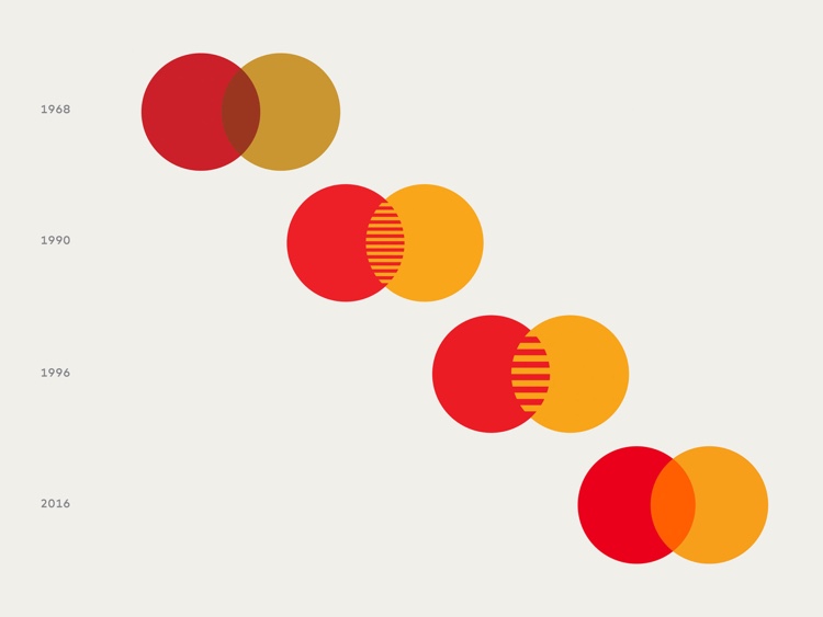
In 1968, two years after its founding fifty years ago, Interbank introduced Master Charge. The name — not yet a single word — first appeared superimposed on two overlapping circles, one yellow and one red. Over the next four decades, this configuration would be repeatedly modified. But remarkably it remained unchanged in its essentials: two circles, two colors.
Every profession has its own answer to the joke question about the number of people required to change a light bulb. In graphic design, the answer is said to be, "Does it have to be a light bulb?" We're taught in design school that the best starting point is a blank slate, a completely open brief. Preconditions are thought to be fatal to creativity. But something surprising happened when we were asked to help Mastercard reconceive its symbol for the 21st century.
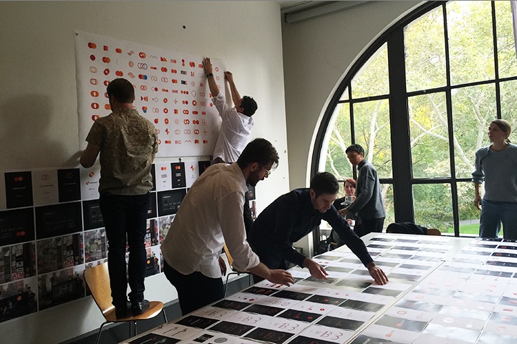
With my colleagues at Pentagram, we did our due diligence and looked at every possibility. We tried different permutations of the basic geometry, logos that just focused on the company name, or the initials MC, or just the letter M. We explored shapes and colors that were entirely new and that bore no resemblance to the Mastercard of the past. But rather than inspiring us, all these wild explorations seemed to be ignoring an answer that was right in front of our noses: the nearly fifty years of equity that the company had invested in one simple repeated shape and two primary colors.

It's rare for a company to maintain this kind of dedication to a single brand identity. Bass Ale's red triangle, unchanged since 1777, is a rare exception. It’s more common for companies to trade in their logos every 10 years or so, sometimes to reflect changes in business strategy, and sometimes, dismayingly, as a smokescreen to disguise the lack of real change.
Research had shown that customers, shown two overlapping circles in yellow and red, could name Mastercard without any prompting. It's almost impossible to calculate the value of owning something as simple as the shape of a circle and two of the simplest colors on the spectrum. And it's impossible to imagine attempting to create that same value with something brand-new today.
So we went back to basic principles. The basic form of the 1968 symbol had evolved over the years, almost always in response to business challenges or technological opportunities. Our new digital world demands reductive concision. How simple could we make those shapes and colors and still communicate Mastercard? We experimented with countless shades of red and yellow, carefully calibrating both colors in combination with the area where they overlapped. We tried many ways of writing the word Mastercard, finally deciding on an all lowercase version that communicated openness and accessibility — and that magically echoed the round forms of the logo in every letter. And, finally, working with Mastercard's talented and inexhaustible in-house CX & Design and Brand teams, we developed a language that could extend the basic symbol's look and feel to all kinds of communications, from print to digital, from customer to consumer.

Sometimes this kind of design process is all about the shock of the new. In this case, one of our greatest satisfactions has been an immediate, almost instinctive reaction: "That looks just like Mastercard!" There's nothing like the satisfaction of looking in the mirror and seeing yourself in new clothes that are completely comfortable and make you look your best. That's what we hope we've given Mastercard.

