Digital design
This is where you'll find digital design guidelines and user interface patterns for web and mobile
About our Digital design systemStyles
The Styles section contains the core components of the Mastercard brand expression with additional considerations for digital experiences.
For more detail, refer to the Brand Design Style Guide.
Brand mark
Configurations
Horizontal and vertical configurations are available for use in digital applications.

Horizontal

Vertical
Placement
The brand mark should be aligned to the left. When space is limited, such as in mobile applications, the Mastercard wordmark can be omitted.

Desktop

Mobile

Minimum sizes
The brand mark should never be displayed smaller than specific sizes to ensure legibility:
Never use the horizontal brand mark smaller than 120-pixels in width
Never use the vertical brand mark smaller than 86-pixels in width

Horizontal brand mark, 120-pixels in width

Vertical brand mark, 86-pixels in width
Lockups
When locking up words to the brand mark in headings, provide a separation space equal to the width of a capital N.


Backgrounds
The brand mark should always appear on backgrounds with sufficient contrast. Avoid colored backgrounds that cause the mark to disappear or vibrate.
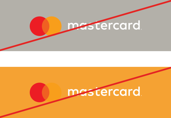
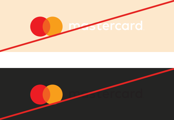
Incorrect usage
Always use approved artwork for the brand mark, and never alter it in any way. Be sure the file you’re using displays at the correct resolution.
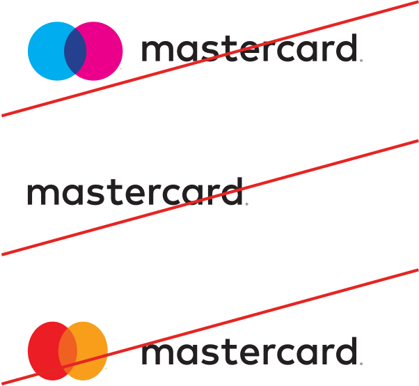
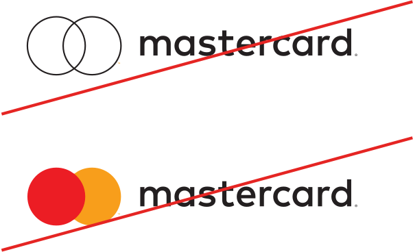
Colors
The Mastercard brand palette consists of simple, clear colors that feel modern and warm, and impart a sense of sophistication. The palette should be used for all digital Mastercard communications and experiences.
For more detail, refer to the Brand Design Style Guide.
Core Principles
Accessibility
Digital experiences should be accessible to users of all abilities, including those with low vision, blindness, hearing impairments, cognitive impairments, or motor impairments. Improving accessibility enhances usability for everyone.
Simplicity
By letting neutral backgrounds dominate and limiting the use of color, you’ll achieve the simplicity that makes Mastercard communications feel open and smart. Work with shades or tints of a single hue rather than multiple colors.
Contrast
Use color to communicate, not decorate. Spare use of the secondary and accent colors can direct the eye to something important, or help delineate the hierarchy of information. The color contrast ratio for text and interactive elements should be at least 4.5:1 for normal text and 3:1 for large text as recommended in the W3C accessibility standards.
Balance
Red, orange, and gold—the primary and secondary colors of the Mastercard brand palette—are muted versions of the brand mark colors. They are balanced to feel welcoming and warm, while at the same time, worldly and dynamic.

Primary
Our primary brand color is a muted version drawn from the center overlap of the brand mark.
Secondary colors
Our secondary brand colors are muted versions of the left and right circles of the brand mark.
Background colors
White and warm gray backgrounds tend to feel inclusive, relatable, and modern. Dark gray backgrounds impart feelings of sophistication and are more assertive.
White background is preferred for most digital situations. Dark backgrounds can be used to add emphasis or contrast, however, avoid situations with all dark backgrounds.
Color balance
Our primary brand color is a muted version drawn from the center overlap of the brand mark.
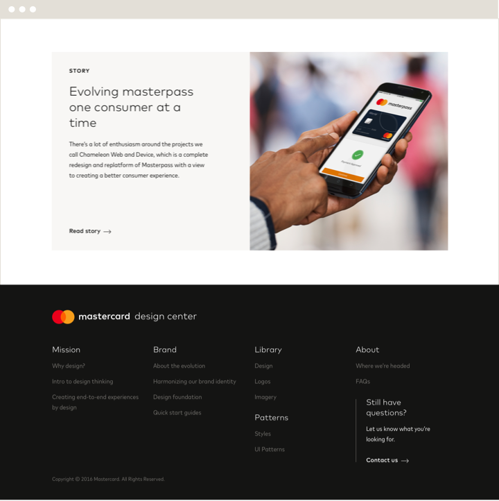

Background
White and light gray
Text
Dark gray
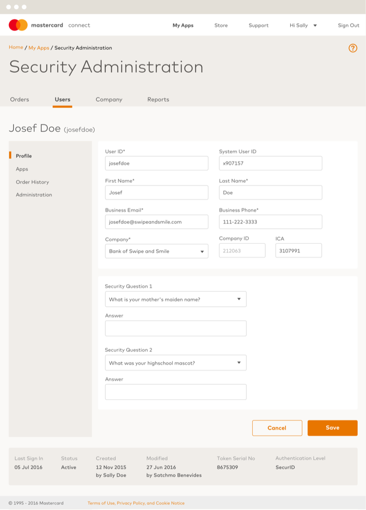

Background
White and light grays
Text
Dark gray and primary orange
Typography
Typography should be direct and legible, while at the same time it should feel light on the page. Always assess the balance between blocks of type and the surrounding open space to engage the reader with a sense of ease.
For more detail, refer to the Brand Design Style Guide.
For code refer to UI patterns
Mark for MC
Use Mark for MC for text slightly larger than 14-pixels in all digital applications.
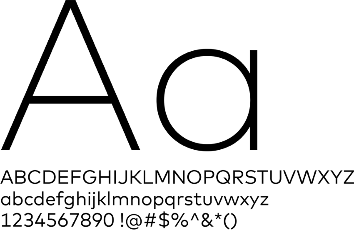
Mark for MC Narrow
Use Mark for MC Narrow for text smaller or equal to 14-pixels in all digital applications. It provides greater legibility for body copy, tight columns, or charts. 12-pixels is the minimum size for Narrow.
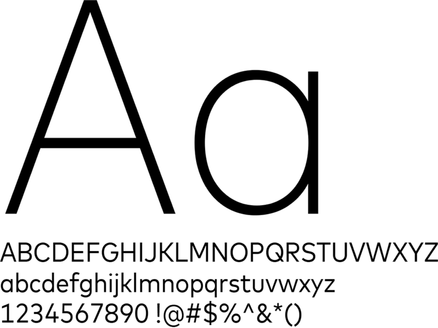
System fonts
Use Helvetica on the Mac platform and Arial on the PC platform when the Mark font is unavailable.
Weights
As the size of the type increases, its weight should decrease. This helps provide an open, light feeling to the application.

Extra Light

Light

Light

Regular

Book
Color
Always be sure there is sufficient contrast between the background and typography. In most situations, type should be white, medium gray or dark gray. Use color sparingly, such as only for buttons and links.
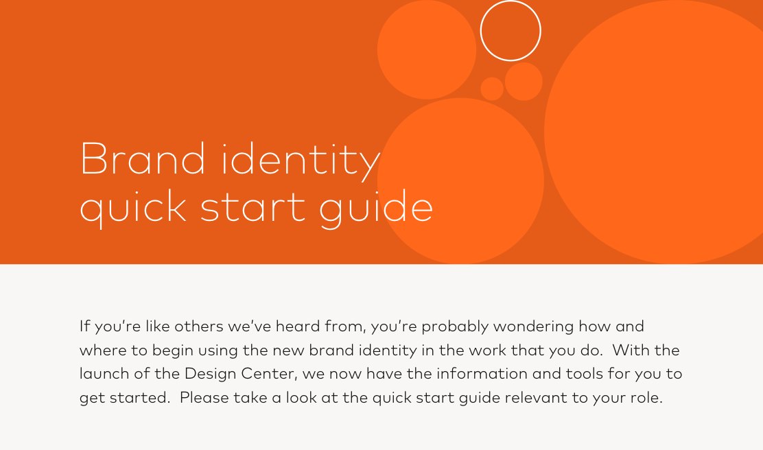
Example of contrast between the background and typography
Brand circles
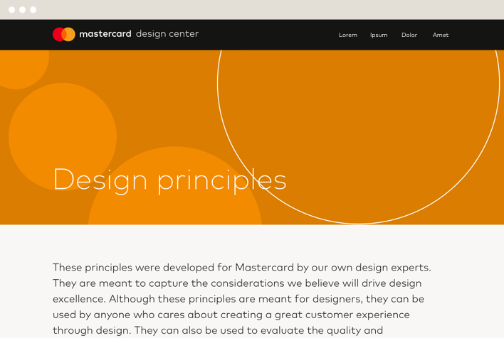
The brand circles design system unifies our communications and experiences in a way that’s both proprietary and instantly recognizable as the Mastercard brand. Brand circles work with any type of imagery, or can stand on their own as graphical illustrations.
For more detail, refer to the Brand Design Style Guide.
Usage
The brand circles design system consists of six different configurations shown here.
To create any of these configurations in your application, refer to Section 6 of the Brand Design Style Guide for detailed instructions. Do not attempt to replicate any of the configurations from the examples in this guide.





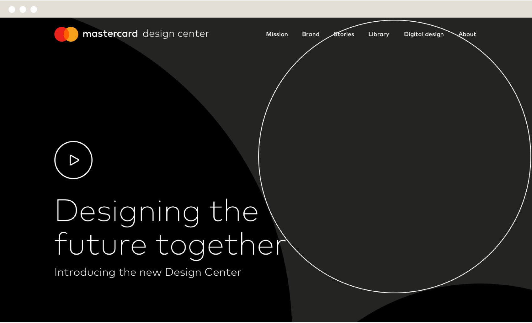
Brand circles work well for hero modules, with or without imagery. They can help draw the eye to a primary headline or provide visual interest to a starting point. However, be sure not to overuse brand circles. Generally, one use in an application is enough.
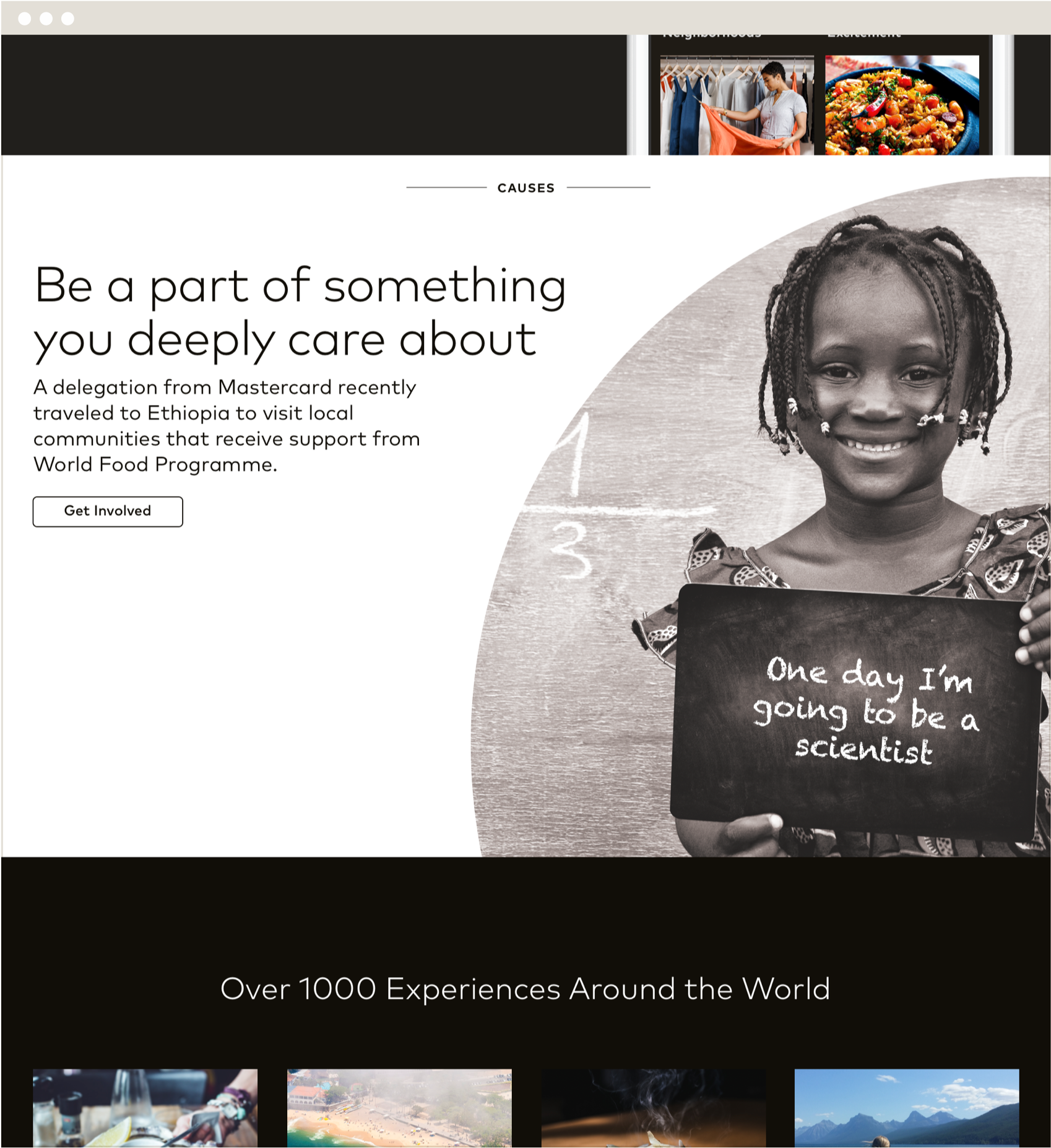
Brand circles can be used as page elements, though they should always be used sparingly. Just as we limit the use of color so that its impact serves a specific communications intent, brand circles also should only be used selectively.
Contrast
Be sure there is sufficient contrast when using typography with brand bircles. The color contrast ratio for text and interactive elements should be at least 4.5:1 for normal text and 3:1 for large text as recommended in the W3C accessibility standards.
In digital applications, white type on darker shades works best in the brand circles configurations. Generally, avoid using dark type on color tints.
