Intro to our
design foundation
Showing up in the world as one brand, with a harmonized identity, is not just nice to have. In today's competitive landscape, people trust brands that have a consistent and distinctive experience across every touch point. From sales presentations and white papers to our digital marketing platforms, it's time to have our identity reflect a forward-thinking, sophisticated, and inclusive technology brand.
Typography
When we communicate in written form, the clarity and continuity of our typography provides a human touch, while also helping to make our communications more focused and less complicated.
Colors
The Mastercard brand palette consists of simple, clear colors that feel modern and warm, and impart a sense of sophistication. It's designed to maintain a strongly unified look and feel, while providing a wide range of options.
Brand Circles
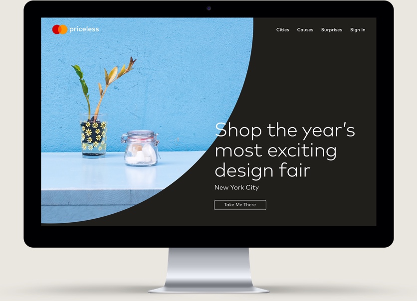
The Brand Circles design system unifies our communications and experiences in a way that's both proprietary and instantly recognizable as the Mastercard brand. Brand Circles work with any type of imagery, or can stand on their own as graphical illustrations.
Iconography
The Mastercard system of icons forms a global language that can communicate big ideas in small spaces. The system includes both a library of useful icons and complete guidelines for creating new ones.

Imagery
Connecting people with priceless possibilities begins when our brand connects with people. Imagery in Mastercard communications and experiences is an essential tool for conveying our attributes, and making our brand relatable.
What's next?
