STORIES
Rebranding in a digital world
JULY 2016 | BY RAJA RAJAMANNAR
For a CMO, there is arguably no riskier undertaking than redesigning an iconic logo and repositioning one of the world's top brands. But that's what we did last week. As the world and its consumers change, one could argue that it's all about the brand. But in many ways, it's really not. Let me explain...
On July 14, we unveiled our new brand mark and the most comprehensive design system ever introduced at Mastercard – over two years in the making. Talk about a business risk. As a CMO, I’m acutely aware of the fact that change at such a visible level is fraught with many risks. Especially for a company like Mastercard whose logo sits on over 2.3 billion cards and at millions of merchants worldwide.
"It is the hallmark of our identity and this gave us great confidence to move forward in our work. You will see how the arcs of those circles have inspired our entire design system."
We knew that our logo was gracefully getting old, at the age of 20. We also knew that people recognize it pretty much universally. And what we knew as well was that we live in a digital age, and we are a technology company in the global payments industry. In other words, we didn't need an explosive new logo that would signify a radical strategic shift. But we did see a need and an opportunity to modernize and optimize our identity for the digital future. So we did it!

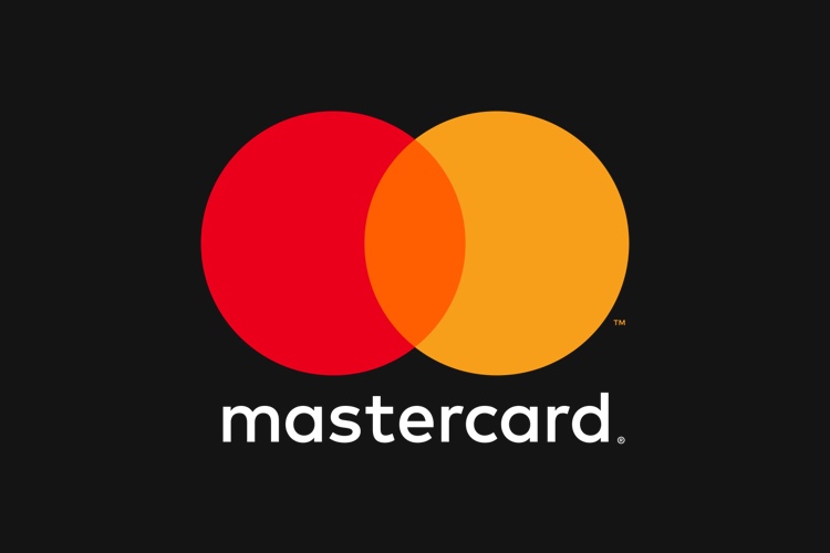
Some of the key changes: We simplified our iconic brand mark so that it's flexible and can work across all digital platforms, retail channels and connected devices. We purposely went with all lower case typography to de-emphasize the word "Card." A subtle but significant change as it represents the different digital and mobile ways consumers can now make payments beyond the physical card in their wallet. It's a nod to the positioning of the brand in a world where you can use Masterpass to check-out online, in-store or in-app; buy with Groceries by Mastercard; authenticate yourself with "selfie pay;" or purchase something with, name your favorite wearable. Our goal was to have our new brand embody the forward-thinking technology company we've become.
What hasn't changed are those iconic interlocking red and yellow circles. Early on, we did some testing, and found that over 80% of people instantaneously recognized those circles alone as Mastercard. It is the hallmark of our identity and this gave us great confidence to move forward in our work. You will see how the arcs of those circles have inspired our entire design system.
The equity our brand has gained over the last few decades is an invaluable asset. A successful rebrand starts with a shared vision of who we are and what we stand for as a company, but the hard part is finding the right expression that feels authentic and connected to our heritage. It also needs to point to a bold vision for the future. This rebranding is our first in 20 years. We needed to think about the look and feel of the brand and how it would sustain well into the future - and have that staying power.
One of the rewarding benefits of taking this risk has been the overwhelming and instant positive reaction to it. Our business partners were thrilled. Even the discerning and critical design and technology publications were enthusiastic. I think that's because Mastercard has other elements of sustainability. It's still about experiences. It's still about providing the best payment and data analytics expertise to our business partners. Still about technology. Still about creating that secure, convenient, and flawless purchasing experience for consumers.
So again, perhaps it's not the brand logo itself, but rather what people associate with it. This comes from the products, services, and experiences we create. It's the things we do, the actions we take as a company that will continue to infuse meaning into our brand over time, that will continue to make it timeless, and in a word, Priceless.
