STORIES
Creating
end-to-end experiences by design
JULY 2016 | BY CINDY CHASTAIN
At Mastercard, we have fully embraced the notion that customer experience will be a critical factor in establishing competitive differentiation in a rapidly changing payments space. But like many companies out there, we are finding our way into how to deliver on that ambition.
But let’s first clarify what we mean when we say customer (or consumer) experience (CX). For many I’ve spoken to at Mastercard, consumer experience is another way of saying digital interface, or user experience (although UX is more than an interface). What we’re really talking about is the collection of end-to-end interactions a person has with a product, service or company, across multiple touch points and channels. Some of those may include digital interfaces. Some may not. Yet, how each one of those interactions is perceived by the customer directly correlates to their level of satisfaction, usage, and loyalty to a brand.
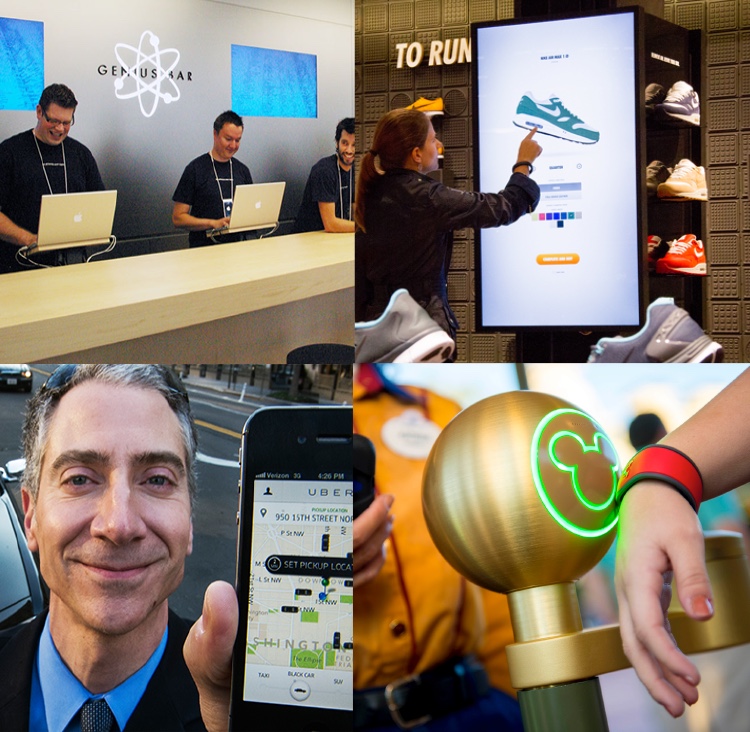
The more positive interactions one has with a company, the greater that customer’s satisfaction and loyalty. Conversely, one big fail could cost us a customer forever.
In the best companies, understanding where and how to drive satisfaction, usage, and loyalty is an outcome of design practices and design thinking. Design is not just a beauty shop stop when it’s time to execute. It’s a critical function, with its focus on human-centered innovation, for delivering great consumer experiences.
Here’s why:
Design helps us better understand unmet needs
It’s easy to understand what to fix, but harder to know how to exceed expectations. When designers get involved in creating experiences, they use techniques to uncover and optimize for functional and emotional needs that aren’t being addressed.
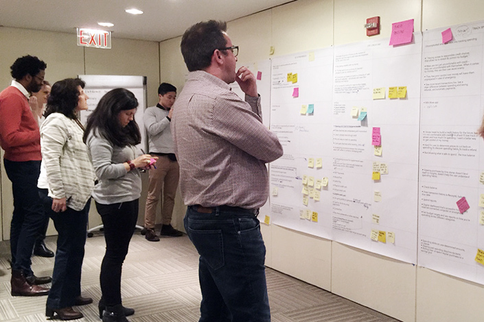
At Mastercard we’re starting to involve business leaders and technology partners in design research practices that look more closely at the human behaviors and needs related to a specific problem we’re trying to solve. This involves having team members participate directly in interviews or field observations as well as bringing real consumers in for co-creation workshops. Digesting a research report is useful, but understanding behaviors firsthand can be transformative.
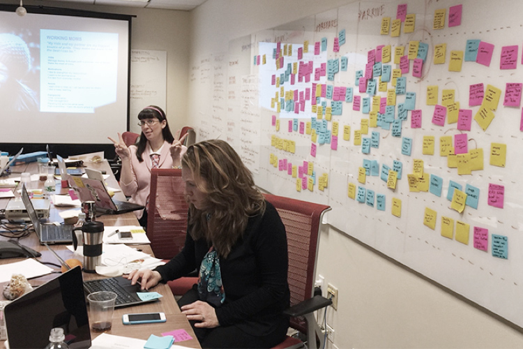
In this project, we were developing a new concept for a global mobile app focused on travel. To help us better understand where we could deliver value in an already saturated market, every member of a cross-functional team conducted user interviews with people who fell into our target segment. Everyone brought their findings to a workshop where those findings were used to map the unmet needs and pain points in a typical travel journey.
From this workshop, we were able to pull out five potential areas for innovation that would serve unmet meets in ways we hadn’t seen elsewhere.
This may not have been a global view (for a global product), but we had to move fast and didn’t have the right level of insights from traditional market research for a larger study. However, having this relatively small sample to start with was a great way to build true empathy with the target consumer and to help us identify the kinds of unmet needs that we could start exploring with a heightened level of confidence. This session became the foundation for our experience strategy for the app.
We are very used to using quantitative data to drive decisions, but small samples of qualitative observations get us to deeper insights that point to unaddressed opportunities for creating value and building true empathy with the target consumer.
Design clarifies how products and services will deliver real value
When designers try to solve problems, they reach for a Sharpie, not a spreadsheet. To help us evaluate and explore how an experience might deliver on the value proposition of a new product or service, we’re introducing design thinking practices to cross-functional product teams.
One manifestation of this approach is the collaborative sketching session, which is designed to leverage the variety of knowledge and expertise in the room to get as many ideas out as possible — and to do it in a way that is visual. For most business folks, this is an entirely new way of working.
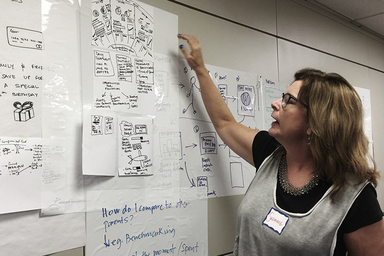
For this project, members of the core product team got together to explore how a new product platform, focused on a family financial hub, could deliver value to the target consumer. Quantitative research had previously identified that consumers wished they had a way to educate their children around good spending habits. We wanted to more deeply understand what financial education means as well as how it might come to life.
To help us build on the concept, two teams were charged with visualizing 1) the kinds of things that were important to teach children, as well as; 2) the ways those lessons might be reinforced in the context of the everyday use of the app.
If you've never done it before, taking the time to put visuals on paper can be a transformative experience. Working this way makes ideas more tangible and it energizes a team who may not have had the license to "get creative" when it comes to developing products. It also shows that design is not just a practice for experts with rarified skills, but a way of thinking.
This single exercise advanced the team miles beyond the old way of "coming up with features" to align to a value proposition. It gave them freedom to fully explore and share ideas and think out of the box for solutions. It also helped us refine the initial product concept in a way that felt more relevant and differentiated. There was still a lot more work to be done, but the clarity that emerged set people off with a shared view of the opportunity.
With the right consumer insights as their guide, these sessions not only help teams align on a collective vision for how an experience will deliver consumer value, but spark innovations in a way that wouldn’t happen otherwise.
Design helps reduce waste and financial risk
In a rapidly changing world, a test-and-learn approach to creating experiences is the only way to ensure that we’re focusing on the right things and getting it right.
At Mastercard, we’re building practices for prototyping an experience before we decide to take it on as an initiative and/or bring it to market. Whether it’s a paper sketch or a role-playing exercise or a fully functioning interface, it’s the fastest, least expensive way to test the viability, desirability, and or feasibility of an idea. It also encourages experimentation and learning.
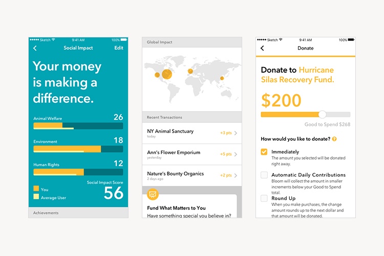
The pre-paid team in core products was tasked with developing a concept for an alternative banking product for millennial consumers. After the usual rounds of research, value proposition development, and collaborative sketching, the thinking was quickly realized in a clickable prototype that was further tested with consumers. The prototype took about three weeks to make, which is on the short end of the prototyping timeline. We focused on the specific journeys and moments in the experience that were most representative of the core value proposition so we could validate and refine the concept with consumer input. The prototype also helped the pre-paid team begin to sell the concept to key issuing partners.
Developing prototypes helps ensure that we are asking all the right questions while creating a product concept. Is it viable from a business perspective, can we actually build it, will consumers want it? What will it cost?
The outcome of this kind of approach is that the business can make informed decisions about whether an experience is worth the investment. It also greatly diminishes the possibility of rework that often happens when we don’t fully validate an idea before selling it in to our customers.
Design drives our ability to deliver an emotionally impactful experience
The way an experience engages the emotions can be directly traced to a person’s loyalty and feelings of satisfaction. It also becomes what people most remember about your brand.
For this reason, design approaches consider the emotional intent as well as the function. Whether it’s how a customer is greeted at a retail store, the tone of voice of an interface or the style and tactile feel of packaging, design looks to engage all of the senses. It looks beyond the functional to ask, "What do we want to make consumers feel? What will make this experience more desirable?"
One of our core design principles is "have an emotional intent." This means knowing what you’re aiming to elicit at the outset, and never forget to find moments for surprise and delight. So what are we actively doing to create these moments— moments where people will walk away with remembering your brand?
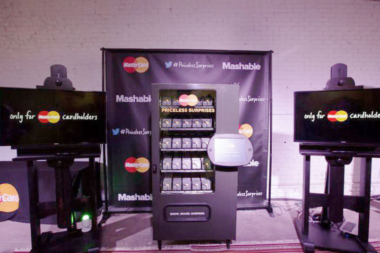
At Mastercard we are at the beginning of a journey to drive this kind of thinking into every touch point. How do we harmonize the visual expression of the brand? What principles will deliver the quality of experience we expect in our call centers? How can we make the end-to-end experience for customers as seamless and pleasurable as possible? Where can we deliver surprise and delight?
To answer these kinds of questions you need designers to help think through the how. And you need them to ensure that it’s executed in the way we intend.
Design is a practice and a way of thinking
Seen in this way, design is clearly a catalyst for innovation and great experiences, not based on aesthetics alone, but on value creation, problem solving, process innovation as well as bringing an emotional lens to concept ideation and execution. And those things are critical to delivering great customer experiences.
