STORIES
Implementing the new brand identity at the Dublin hub
October, 2016 | BY Tansy Murray
Consumers expect digital products to be useful, beautiful, and valuable. We are so familiar with great UX design via the phones in our pockets, our expectations for great experiences have never been higher.
Nobody has time for bad user experience. In fact, people remember the bad experiences more than the good. Users’ tendency to identify flaws in designs raises the bar for what they consider acceptable1.
It is timely that Mastercard has launched the new brand mark and identity framework. Our new identity has the principles of good design at its core – a beautiful new color palette, a focus on the importance of typography, harmonious layouts that facilitate understanding, and of course, the brand circles which are instantly recognizable as Mastercard.
Customer experience encompasses all points at which a person interacts with Mastercard. Customer experience is measured in overall experience. Our new brand identity gives a cohesive look, style, and tone of voice to all of these touch points. We are speaking to the consumer with one voice.
Our new brand identity is not just a set of aesthetic principles. We’ve all experienced products that look beautiful, but are a disaster to use. The new brand system facilitates both a good customer experience and a good user experience. What’s the difference?
User experience deals with people interacting with a specific product, and the experience they receive from that interaction. Can the user complete the task they set out to complete? Are they satisfied with the journey to complete that task? We now have a set of design principles with empathy at their core to facilitate a user’s product journey.

Local Market Intelligence (LMI)—implementing the new design principles
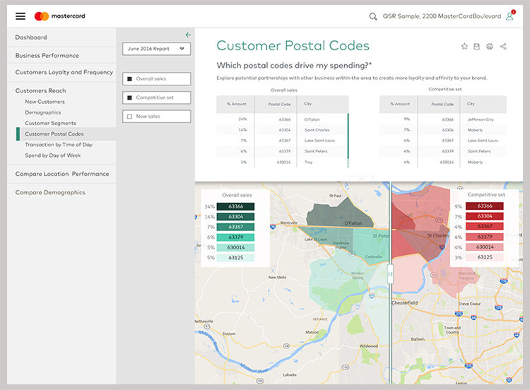
We are currently working with the LMI team (Enterprise Data Solutions, O&T and Info Services Advisors) to redesign the UI for the LMI application. LMI provides merchants with key metrics and insights related to how their business is performing month by month and how they compare to their competitors. Simple, intuitive design is pivotal. After all, these metrics will drive some of the most important decisions a merchant can make about their business.

The LMI team are keen to have a platform to showcase Mastercard’s valuable data without appearing complex and difficult to use. Our key product contact, Hemal Sanghvi, encouraged creative thinking and challenged us to explore widely. Hemal also understands that great UX design takes time. We were given the space to explore, discover and iterate. This project is currently a work in progress and we are at draft stage.

Abstraction
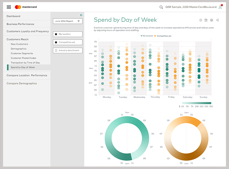
As a team, we focused on abstraction—reducing the complexity of elements so that the experience appears intuitive. We were aiming for a light, uncomplicated UI, so the whites and grays are used to softly divide the screen between navigation and content. We decided to remove the small, modal graphs that had been on the original design and replaced them with large scale, clear graphs. As Steve Jobs understood, less is more in UI design.
Color
Sergio used our new color palette throughout. Soft grays and white predominate. The highlight colors of orange and green add great vibrancy. But importantly, the highlight colors establish hierarchy. The user instinctively knows what’s important and what’s not. There is no ambiguity. The colors clearly signify to the user where the important elements are and how to interact with them.
Typography
Typography in the application is enhanced by the use of our beautiful new house font, Mark for MC. The legibility and readability of this font are excellent. It's based on the geometric tradition, so it has that circular openness to each letter, which gives a feeling of space and simplicity. Lovely wide lettering makes it feel open and legible. It has a low X height so it retains that openness without the ‘flashiness’ of long extenders. So it’s a hard-working font, great legibility—very contemporary but absolutely not showy.
Brand circles
As LMI is a tool to analyze data, we were careful not to overdo the circles. We used circles where it made sense to do so as a ‘nod’ to the brand motif. However, the most important thing here is that merchants understand their data immediately. The user experience was never sacrificed for the circle motif.
Starting from scratch—wireframes
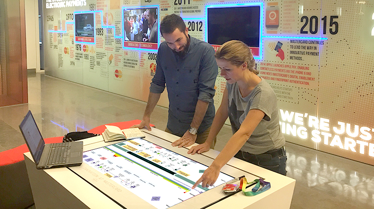
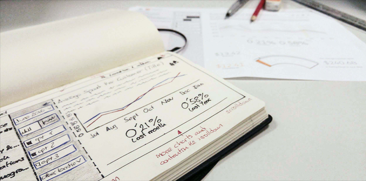
The design challenge for our lead designer, Sergio Mansilla, was to reduce the complexity of the application whilst improving the usability. Collaboration is key to design thinking, and we started with getting input from our fellow UX researchers in St Louis, the business owner, the product owner, and technologists. Based on those conversations, Sergio began with wireframes, hand drawn in this case, starting to understand the ideal user journey and how that experience could be improved.

Icons
The new icons available in the design center are line drawn (no fill), and are a natural extension of the typography with a clear, unpretentious drawing style. Sergio used the icons that were available in the Design Center Library. He also sourced additional icons in the same style to create a cohesive ‘family’ of icons to tie the design together.
Prototyping, testing
At this point in the product’s development, we are getting ready to test the prototype with real merchants in the field. This step is crucial. We need to test our assumptions—prototype, test, iterate, repeat. I will post on Design Center again with an update on how the product development is going and how it tests in usability labs. Stay tuned!
What’s next?
At the Dublin hub, we are currently working on testing and designing several new products including a new UI for 5One, a dashboard for the Citi Knowledge Center, and the biometrics app Identity Check. We’ll continue to implement the new brand identity on these products within the Mastercard ecosystem. We’re not there yet, but the realization of a cohesive suite of ‘identifiably’ Mastercard products is in sight. We are getting closer to delivering truly great customer experiences.
